For larger view click here
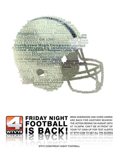
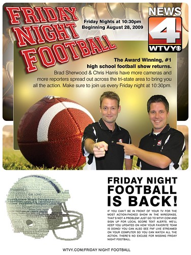
Here's something new from work. A full page ad presentation for a local magazine. It was rejected by the powers-that-be, not because it isn't any good but because it doesn't show Chris & Brad, or the Friday Night Football logo like the image below.
This represents approximately 15 hours of work. The ads combined represent about 23 hours over four days. It's not that I don't like the one the GM chose, it's just that it is not nearly as iconic as the helmet.
For the record, the inspiration for the helmet came from CBS's graphic ad for the 50th anniversary of the Grammy Awards.
Here then is the one I turned into the publisher this afternoon.
Here's my dilemma: I like this one a whole lot. That is, until I finished the helmet I was going to put at the bottom... like so. When the helmet was finished, Bent remarked that it looked too good to just sit at the bottom; that it should BE the full-page ad. I tended to agree, and even pushed it as a better ad, but Roger, the GM, thought not.
So now I look at my original, and while I liked it to begin with, I don't now. I still recognize it as a great ad [the "Friday Night Football" lettering alone took me about 4 hours!], it had fallen from grace the moment I realized just how beautiful the helmet looked.
Anyway. I was given this project on Tuesday... Noon-ish... and finished it-- mistakes, tweaks, burnt to disks and delivered, at end of day today. Three and a half days all told.
I used Illustrator CS3 and Photoshop CS3 to produce these two ads. The originals are both 2250 pixels x 3000 at 300 dpi, CMYK format [for those who wish to know]. The PDF version I turned into the publisher was 95MB... big BIG file.
Boo Georgia! GO POKES! Lasso them 'Dawgs! Hoo-ah! Oklahoma State! OSU! Woohoo! Yeehaw!
:-)
Let the season commence.
(Never can remember if yer a Georgian or a native 'Baman, but I'm figurin' Deep-in-the-Heart-of-Dixie pride'd have you hollerin' for the 'Dawgs in any case.)
Native Floridian, btw, but "GO Dawgs"! anyway.