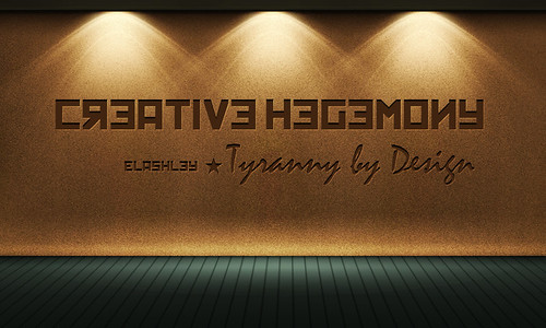
I had some time to kill this morning so I worked through a tutorial. Here's my result.
I found the 'Kremlin' font a few days ago and was hoping for an opportunity to use it. I want to redo the header at American Descent using this font, but I haven't had time to even think about it, let alone build it. So I settled for this, although... I shouldn't say 'settled' because this actually looks nice.
The tutorial called for a different font, and a thoroughly uninspiring phrase. I added the star, and think it adds a nice touch, complimenting the theme the font suggests...
12 Comments:
Subscribe to:
Post Comments (Atom)
Just curious.
Actually, this image was part of a tutorial. I had never heard of Karbaras before this, but it is a very interesting and potentially useful program. I intend to get plenty of use out of it.
That's one of the software products I use.
Now, having said all that. I've never used it. Wouldn't want to, in fact, because I've got 10 years experience on Photoshop. I can only assume that Photoshop offers features that Gimp does not, because from what I've seen, the interface of functionality of Gimp isn't too markedly different from earlier versions of Photoshop. It's a preference thing, I guess. Having used Photoshop for so long I prefer it to anything else.
May I ask what you use Gimp for?
And yes, sometimes I feel like a target though, oddly enough, that wasn't going through my head when I staged the photo. I just thought it would be humorous.
Sometimes, at work, I have used it for creating or manipulating images for documentation.
Mostly for cropping, color manipulation and adjusting, brightness and contrast and every once in a while, playing with the artsy side of the tools (making a photo look like an oil painting or pencil sketch, etc).
For the basic stuff I do, it's fine and the price is right. I'd like to learn how to do more, but find it hard to make time.
30+ Exceptional GIMP Tutorials and Resources
GIMP Tutorials
my flickr
As you can see, I can do some manipulation and stuff, and it's enough to entertain my daughter and friends, but it's clearly not very artful or well-done.
Thanks for the links, I'll check them out as I get a chance.
Happy New Year to you, Eric.
Here it is with a vintage/porcelain look.... I uploaded it to our servers and attributed you (Dan Trabue/Payne Hollow) for copyright purposes. I have a Flickr account but I was already in our servers... this was easier.
By the way. I may never have told you this, but you are a fine photographer. You have a really good eye, and as far as composition goes you do quite well.
Saerie 2